Redesigning a legacy administration tool
TL;DR I created a rework for a legacy administration tool that was used by different user groups.
Goal: A legacy system that had grown organically over the years had to be turned into a tool that could be used by new colleagues as well as experienced colleagues.
Situation: The system was over ten years old and no one really knew all the functions anymore. It was a highly complex administration tool that could only be replaced step by step because it was in daily use by several different departments. Each department had different needs and had established training for new colleagues where it took several weeks to get to know the system well enough to be able to work independently.
My role: I was the only designer on the project with several developers. We had no design system or style guide at the time that could be used as a reference.
Approach
- get information about the system and its usage in daily work
- redesign information architecture
- redesign starting page
- design patterns for different page types
1. Research
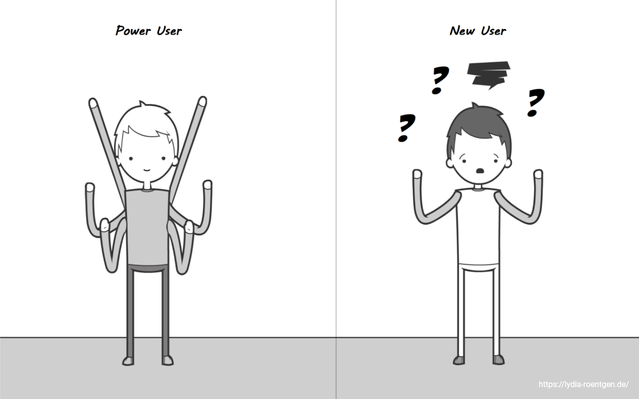
I started by interviewing colleagues from different departments about their work with the system and watched their work. It turned out that each department had very specific needs and ideas which parts were the most important. I kept an eye out for similarities, because I needed to find some common ground for the basic structure. As the company was growing fast there were many new users who only knew the one or two things they needed to do on a regular basis. On the other hand there were those working with the system since it existed who had written their own macros and knew even many of the obscure functions.
Usual goals inside the admin tool included finding an object for information, getting a list of certain objects and going to a current project customer to change something on the account.
As the system contained lots of current customer account data many users were really afraid of changing important data which could potentially result in blocking a customers account.
2. Structure
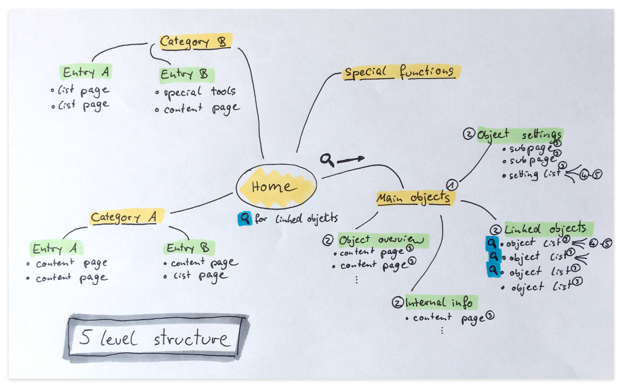
The challenge with the structure was that while most objects were on a customer account level, making the customer account the highest level in the hierarchy, there were also a few tools that were on the level above to influence multiple customers and even some that had no relation to the customer data at all. Even then the hierarchy was multiple levels deep and not well represented in the legacy system, as it had an „everything is always visible“ approach, so many of the current users had a different view on what a logical structure would be.
Disconnecting too much from the old structure would not work because that would too heavily upset the power users, however some change was needed to get at least a learnable structure for the normal users. I discussed several possible approaches and then tested the one that seemed the most probable to work. It took several iterations on the menu to find a compromise that was useful but not too upsetting.
3. Starting page
The starting page had a similar challenge to keep all the functions the power users wanted and used on a daily basis while still being easier to use and understand for new users.
The link list
A particularly tricky part was a big link list at the bottom of there page that linked to many places that had been heavily frequented over the years. Most of the links were not actually used by all departments, but only by a few people who regularly worked in these areas of the tool. As completely removing the list would not work I tried a different approach and turned the space into a personal link list where each user could save their own shortcuts. This made the list completely optional which was perfect for the normal users and still retained the function of jumping into the deep corners of the tool for the power users (although they needed to set it up first). After some time coming back it turned out that some people were not using the feature at all while others said this little bit of freedom was their favorite part of the redesign and saved all the important links to their current project there.
Search behavior
One of the most common actions in the system was using a search for a certain type of object. Watching the users I had learned that the search results had not been of a very high quality, requiring the users to scan multiple pages of search results before finding the object they needed.
When we tried to replace the old search a lot of strange requirements popped up e.g. some users wanted to be able to sort and filter search results or export the results to excel. In further interviews it turned out that these users were not trying to find a single object, they were trying to create lists. These lists would then be used for many different purposes like doing an evaluation of all customers in a single country. Using the search for this purpose was already a workaround, because the only other possibility to get that data was to ask the dev team to do a database request. Discussing things with the developers it turned out that these types of requests were actually really frequent and took a lot of time for the team to respond to. Some departments required a new up to date list of the same data every week.
So instead of incorporating all these features into our new search we added a self service list generation tool to the new system that was separate from the search. As a result the development team as well as the other departments had a surge in productivity, because all standard requests for data could be handled immediately and on their own. It was also much easier to manage permissions in the new tool to restrict access to sensitive customer data inside the company, boosting data security as well.
And of course we improved the search as well, which was met with a lot less resistance now that the secondary use case was covered and the search actually provided the most useful results on top.
4. Page types
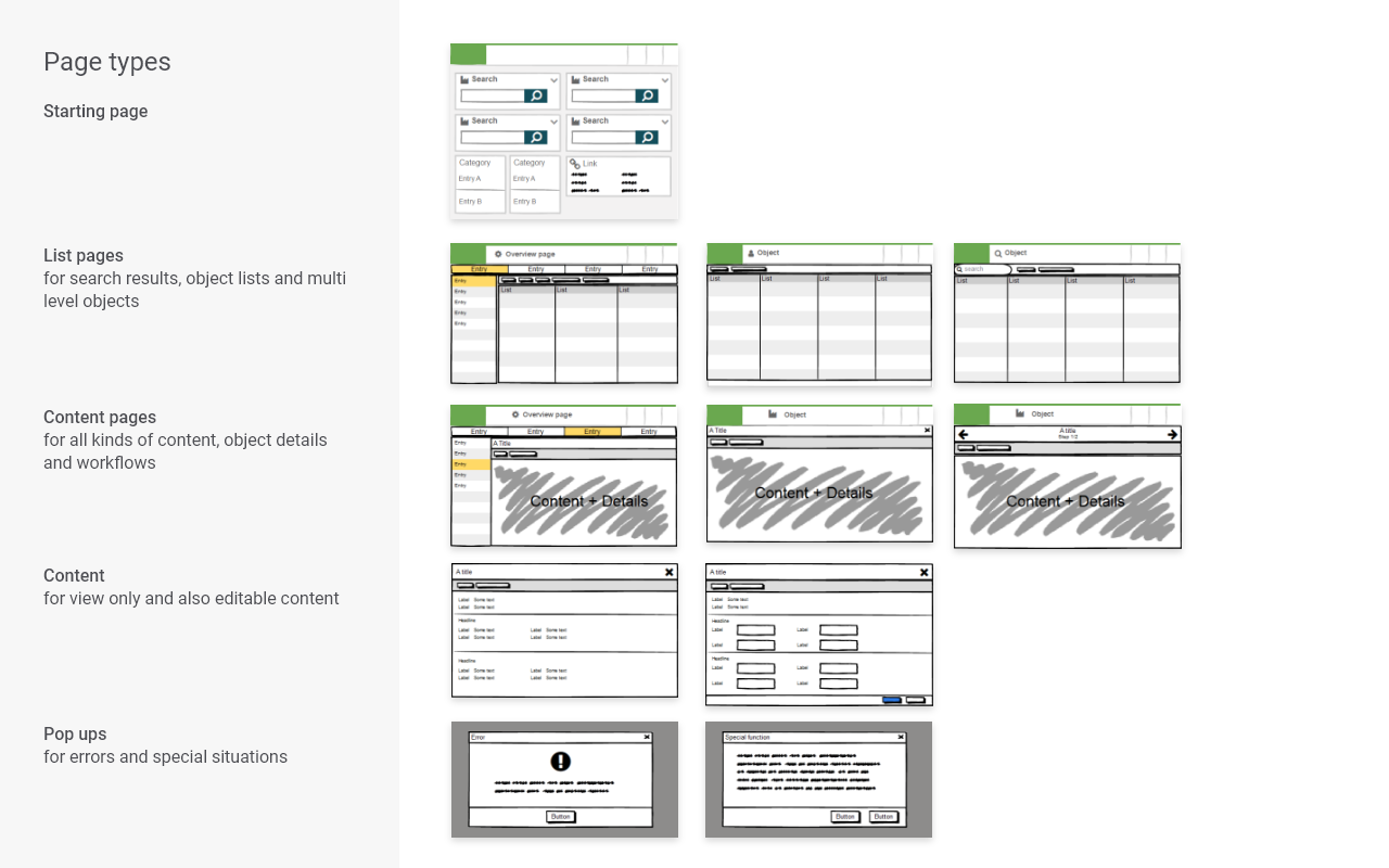
Another important step was providing basic designs and patterns for different page types. The tool was over ten years old and had too many pages to create single designs for all at once. The migration from the legacy system to the new one was going to take years, so what was needed was not actually the detailed design, but instead a frame of reference for future work.
The challenge here was to be generic enough to allow for a multitude of new and old functions but at the same time to be specific enough to actually provide guidance and produce some level of consistency.
I separated the old product into different page types like „form“, „list“ etc. and created basic patterns for errors, pop-ups, editing, navigating and many more. In the following years myself and other designers used these patterns every time a new big feature got migrated, updating them until they were merged into our developing design system.
Final result
In the end I created a good entrance point and foundation for the full migration of the system. And while there were many problems with migrating a running and used system step by step the whole team now had a basic understanding of where they were going from a UX perspective, enabling them to work more independently. I still supported the team for the following years, finally handing over the project to another designer.
Learnings
In this project I learned the immense value of being in really close contact with your users. There were many situations where their feedback was really important and improved my design, where in another project you may not have asked them because contacting a user would have been much more effort. On the other hand, I also learned to face the dangers of being really close to your users like staying in control of too much feedback and managing personal opinions.
I also learned to handle a big design project all by myself, conducting all the research, prototyping, wireframing and graphic design without support of other designers.
In this project I learned to love complex systems, because while a legacy administration tool might not be really fancy, it sure is an interesting challenge to balance all the different connections and dependencies in your head while designing.
Constantly balancing normal users‘ requirements with those of the power users taught me a lot about prioritizing and compromising to accommodate different target groups.